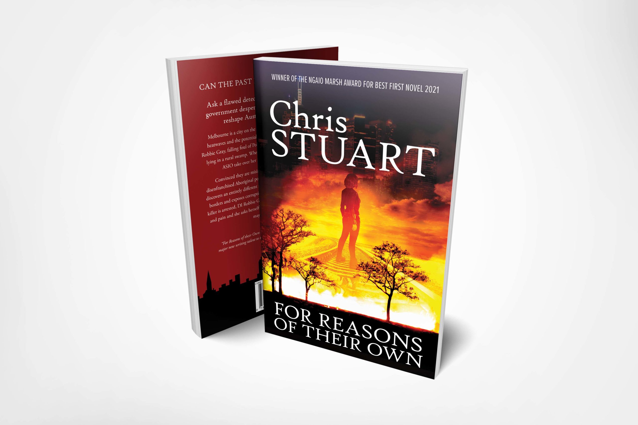
New book cover design
Writing a book is no easy task, but once it’s finished and there is no magic publisher in sight, there is a whole new learning curve to navigate in the world of marketing. Once the blurb is written for the back cover it is time to consider what the book will look like at the front. In my head, I always imagined that the cover for my debut novel would have a passport, mainly to infer that the plot had something to do with travel.
I also wanted an immigration stamp, for the same reason and border crossings play a particularly important role in the book and I thought the yellow and black crime scene tape would add the word police procedural to anyone’s thinking and finally, I wanted the red and black colours to signify the bushfires, and the heat and the drought which so sets the book in the stretched continent of Australia. I worked closely with a talented local designer, Bryce Wastney and loved our original design.
It seems that other people, more learned than me in the marketing arena, didn’t quite share my vision. Feedback was the cover looked like a book on immigration and in no way resembled a crime thriller. As books are judged by their cover and bowing to my betters, we have a new cover and I do admit I love it. I think it captures all that I intended, only in a different more stark way. I was also able to place a review on the back and have my Ngaio Marsh win announced on the front.
I would be very interested in any feedback.
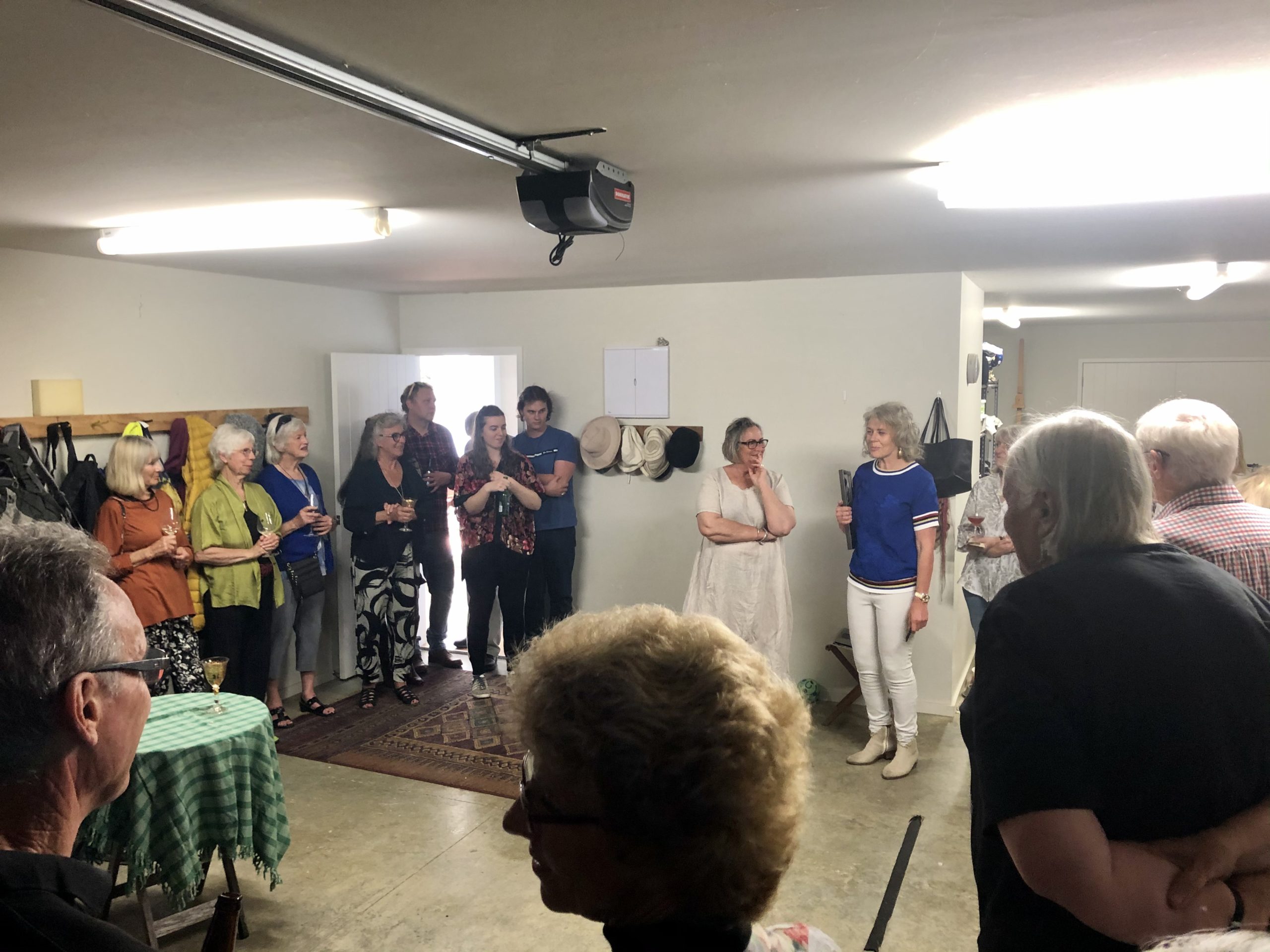
We had a celebration at my home when I won the Ngaio Marsh award where I announced the title and spoke about the new book. It was a very special day and I am very thankful for all my friends, family and followers for their loyal support.
Related Posts